Assessing Humor on WhatsApp

My friend group uses WhatsApp to stay in touch. As our lives progress it’s a great way to stay close. But the thing that binds us together the most is probably humor. It’s how we bond and it’s fun!

A couple weeks ago I asked my friends a simple question: Who in our group is the funniest? I received 5 different answers.

Hmm.

I got to thinking: could I machine a process to read the raw text of a WhatsApp chat and use MATH to determine who is the funniest? The answer, it turns out, is yes.*

I’ve written python code which ingests a WhatsApp chat export, interprets laughers & jokers, calculates humor metrics for each member of the chat, and visualizes the results. I invite you to take it for a spin on your own chat – clone my github repo.

How it works

How can we measure how funny someone is? By how much laughter they cause! That’s where we start: identifying laughter. Messages are flagged as containing laughter by performing keyword searches for known laughter terms (LOL, haha, 😂, etc.). That’s the easy part. Next we need to determine who caused the laughter.

To link laughter to its originating “joke” in an automated way, we need to look at the preceding chats and consider some rules:

  1. Is the laugher responding to a quoted message? If so – you’re done! Easy one!
  2. Is the chatter == the laugher? If so, keep looking.
  3. Does the chat also contain laughter? If so, keep looking.

The first chat we come to that does not fail on the #2 or #3 is credited as the ‘joker’. Here’s an example:

What successful laughter attribution looks like.

*It’s not perfect

Any machined process will lack the nuance of a human. Mistakes will be made! The code will link laughter to the wrong joker at some frequency due to the challenges around interpreting human language.

What UN-successful laughter attribution looks like.

But after observing chat behavior for some time I estimate that this approach properly assigns laughter about 90% of the time. And assuming random assignment of the remaining 10% we shouldn’t be advantaging anyone by too much – though more active chatters will tend to have an advantage on that account.

It also goes without saying that this code may not correctly assess humor in the real world; its perspective is limited to the WhatsApp chat!

The metrics

Now that we have a dataframe containing jokes + laughs, we can perform some analysis to develop features which describe how funny each chatter is. I’ve come up with 4 metrics. Why 4 and not just 1? Because something as complex as humor can’t be captured in just one number!

Weighted Laugh Score

Let’s start with the obvious one: Who caused the most laughter? But not all laughter is created equal: ‘Haha’ < ‘Hahaha’ < ‘Hahahaha’. We assign a “weight” value to known laughter keywords which describe the strength of the laugh. This metric is the sum of all laughter weights caused by the joker in the full chat.

Joke Proportion Score

How frequently did each chatter tell a joke? We want to value low-activity chatters who are often funny, and penalize high-activity chatters that produce a lot of unfunny messages. This metric is all about the “humor value” you create as a proportion of the count of your chats.

Laughter Distribution Score

OK – maybe you are causing a lot of laughter and you have a high joke proportion in your chats. But do you have broad appeal among your audience, or are you getting all your laughter from a vocal minority? This metric reduces the score for jokers who get a disproportionate amount of their laughter from a subset of their audience; it boosts the score for jokers who have an even spread of laughter from all members of the chat.

Big Joke Score

Similar to Weighted Laugh Score, but now we’re only crediting “big” jokes – defined as any message that causes multiple people to laugh. I felt this was necessary to further disambiguate truly funny messages from messages that elicit only a casual ‘haha’.

These metrics are weighted evenly and rolled up into a composite humor score.

Putting it all together

With the data compiled and calculations complete, we can visualize the results! To illustrate I will share the summaries produced from one of my chats, “Beware of Trolls”, which presently includes 13 members and has accumulated over 17,000 messages thru March 2020.

Behold!

The humor champions revealed

Same chat, each metric reported individually:

Results for each humor metric

Monthly analysis

With the code written for overall humor summaries, we can produce the same summaries by month, creating opportunities to do a number of cool things. Show trends over time, and look at at someone’s funniest month!

Here is my own trend line showing my humor score over time:

My own humor score over time. Middle of the pack!

But what we really want to see is how we compare to other members of the chat. So we plot the top 9 jokers together!

It’s more fun to plot 9 lines side-by-side!

And with humor scores for each month calculated….we can determine every chatter’s funniest month! Wow.

Mine, it turns out, was November 2018. Because of this joke:

I turned “Wolf of Wallstreet” into “World of Warcraft” – clearly I am the authority on humor.

That’s it folks. If your interest is piqued, feel free to try it out on your own chat. I welcome collaborators and suggestions!

Stay funny everyone. We need humor now more than ever.

Reasons Why My Dad Emails Me

My Dad, Russ Bell, turns 60 years old next week. In honor of the occasion today’s blog post will investigate what makes my Dad tick, that we may better understand the man who has so profoundly impacted my life.

By reading all his emails.

During the last 10 years (2008 – 2018), Dad emailed* me 261 times. I have gone through each email, recorded the send date, and coded a category class. Let’s take a look!

Reason Why My Dad Emails MeEmail Count
Scheduling/Coordination56
Family Message/Share Photo48
Groupon/Deal/Event Notice45
Share an Article41
Cybersecurity/Technology/Other Warning24
Give Advice23
Share Something Funny18
Ask a Favor6

*I consider the initiation of an email thread to be 1 email; subsequent replies and replies in email threads which Dad did not initiate are not counted.

I originally had this idea because of one category in particular: cybersecurity warnings. Being the millennial that I am, I always regarded these messages from my more techno-phobic father with some amusement. So I had this plan to record ALL his emails, and class them in this way. But as you can see, those virus / phishing / scam warnings are only a middling class.

It turns out, my Dad emails me about a number of other things. And that has changed with time:

2013 was a bad year for email, apparently.
2012 had a lot of dinner & happy hour invites; 2018 contained my grandparents’ 75th wedding anniversary celebration which my dad helped arrange.

A few things jump out at me:

  • Dad gave me a lot more advice 10 years ago. Maybe he thinks I no longer need advice?
  • Dad hasn’t asked a favor over email since 2010. Does he no longer need help? (really, it’s because I lived at home 2009-2010)
  • Dad largely stopped sending me Groupon/deal/event suggestions after 2015. Does he think I’m now capable to find my own opportunities?

The Groupon/LivingSocial thing is something else that sparked this idea in me. My Dad would frequently forward me a restaurant deal he received, or a notice of some upcoming event that he thought I would enjoy, and I always found this very endearing. Here’s a notable series of examples:

7/19/2011 – Free Papa Johns
7/21/2011 – Three-Hour Bike Tour for Two People
7/22/2011 – Tioga-Hammond Lakes, Pennsylvania (idea for visit)
8/02/2011 – Free Cheesesteak from Jerry’s
8/10/2011 – Free Cheesesteak from Jerry’s (same offer a second time)

Adorable. So what else can we derive from Dad’s emails? How about his activity by day of the week:

Dad did most of his damage Monday – Thursday.

What if we compare his behavior during the work week to the weekend?

Dad was more likely to send cybersecurity warnings and Groupon offers during his work week; scheduling/coordination and family messages on the weekends. Makes sense!

As I worked on this, I reflected on the power of digital records. I read exchanges I had with my father nearly a decade ago of which I had no recollection – yet, here they were in present-day clarity. What an amazing resource for traveling down memory lane, and for longitudinal analysis.

More than anything I reflected on my father. I presented myself with hundreds of messages he sent me over the years, stacked back to back like a decade-long conversation. What may have been obfuscated by isolation before was now made clear in the aggregate.

Why does my Dad email me? I saw 8 reasons:

Scheduling/Coordination – Above all else, Dad wants to hang out with his family. He also wants to make sure you know the meeting time and address.

Family Message/Share Photo – Like his father before him, Dad sees himself as head of household and feels a responsibility to make family announcements and send thoughtful family notes. Email is the perfect vehicle to bind our large group together with news, community, and care.

Groupon/Deal/Event Notice – Dad is always thinking of his family: what they may enjoy, and how he can help.

Share Article – Dad wants to make sure his family is informed with the best information.

Cybersecurity/technology/other warning – Dad worries about his family and wants to make sure we stay safe.

Give Advice – Dad wants to make sure has done everything in his power to set us on the right path. Sometimes, he tells us what we need to hear. On 11/18/2010 he wrote: “What I know and you should know is that your potential is unlimited.” On 4/3/2012: “Embrace what is inevitable.”

Share Something Funny – Life is more fun when you’re laughing; that’s why he married my mother, and why I married my wife.

Ask a Favor – Sometimes, Dad needs help too.

Really, my dad emails me because he loves me. And I feel very lucky for that.

My wife is 38 weeks pregnant, and if all goes according to plan I will be greeting my own son in March. I wonder what sort of messages I will send him during his lifetime. I have a pretty good guess.

8 Signs That You’re Good At Fantasy Football – #5 will shock you!

Football season is here at last.

More importantly, fantasy football season is here: that blessed ~5 month period when I get to obsessively check for updates about my team, agonize over start/sit decisions and, occasionally, actually watch a real life televised football game.  (I take the “Moneyball” approach to team management; sports fandom takes a distant backseat.)

Like many, I’ve participated in the same fantasy football league with my group of college friends for years; last year marked our 10 year anniversary.  It’s a competitive league.  Everyone tries hard, does their research, and pays attention.  And everyone thinks they are the best.

Trash talk and gloating are the traditional pastimes of fantasy football leagues.  Not so in mine.  We’re actually pretty polite.  But we do share the same irrational belief which animate those habits: that we each possess some secret sauce which is going to get us that championship.  This year, this time, finally, this is the one.  But of course, if such secret sauce did exist, someone would be getting rich.

Still, being the data nerd that I am, I wanted to see if I could answer the question of “who is the best at fantasy football?” with some degree of objectivity.  I started by collecting core statistics about season finishes: win percentage, season finishes, points scored, etc.  My goal was to diversify my approach, collecting many different metrics which, considered together longitudinally, would create a composite fantasy football score.  As I neared the finish line, I began to experience doubt, not unlike Eve before she ate forbidden fruit from the tree of knowledge.  Part of the fun of fantasy is that each year presents a clean slate of new opportunity; knowing where you truly stack up would, for many, be a bitter fruit indeed.  Also, everyone knows fantasy football is a crap-shoot; what confidence could I have in a ranking system anyway?

Well, I suppose the difference is: Eve ate from the tree of knowledge, and I built the tree.

A detailed explanation of my composite fantasy score methodology will follow.  I encourage you to download my work so that you can review and follow-along.  Helpful note: orange tabs contain the final numbers which comprise my scoring system; red tabs contain visualizations.

Composite Fantasy Metrics

I first developed my composite metric system for fantasy football leagues in 2016 and I’ve iterated since that time.  My latest system uses 8 metrics, which are weighted according to their relative importance at discerning fantasy “skill”.  These are the metrics:

Metric Justification Weight
Draft Efficiency Efficient usage of draft dollars to acquire maximal team: measure of predictive skill. 5
In-Season Pickup Saavy How effective were you at picking up important players from waivers and trades? 5
Weighted Average Season Rank How have done performed across all seasons?  It’s not enough to be stellar in one. 18
Playoff Win Frequency Gotta be clutch to close out the season in style. 8
Average Win Percentage Across all seasons, have you won more than you lost? 8
In-Season Consistency 125, 125, 125 is better than 150, 100, 125. 8
Average Z-Score Points For The most important metric.  A measure of relative performance of owners compared to peers, by the most reliable method: in-season points accumulated. 40
Average Z-Score Points Against We cannot control the points scored against us.  How unlucky were you?  Did you succeed in spite of it?  If you got a lot of points against you, then you get a bump; if you didn’t, then it counts against you. 8

100 possible points across 8 metrics, each attempting to capture an aspect of what characterizes a “good” fantasy owner.  And crucially, I am taking averages across all fantasy seasons for the league.  Grading fantasy owners on their full career rather than a single season allows the highest performers to emerge.

Here are the metric weights visualized:

The weight given to a metric is largely based upon my discretion and judgement.  In deciding weights I think about: A) To what extent will strong performance in this metric be indicative of fantasy skill?  B) How much noise is likely to be present in the data amidst the signal?

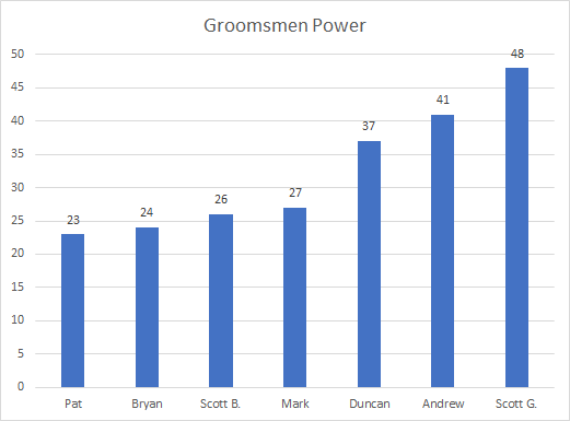
Enough already.  WHO’S THE BEST?

Results

Patrick.  Patrick is the best, dammit.  These are your sentences Patrick where I say how good you are at fantasy football on my blog.  I hope you like them.  Ok, you’re done.

The above graph shows the latest composite scores for all 10 owners in my fantasy league.  Here’s how those scores have changed over the past 3 years:

Check out my meteoric rise!

To offer greater visibility into the scores, I’ve provided some dynamic visualization tools in the Excel file.  In tab “Graph Owner Over Time” I show how each metric changed for an owner each year, allowing the impact of individual seasons to be assessed.  One of my graphs is below.  2016 and 2017 were both great seasons for me, which is why you see my average rank and points for scores go up.  But with this system, it’s not enough to be stellar in an individual metric.  To perform well, you need to demonstrate excellence across the board.

Tab “Graph Metric Over Time” shows how each owner changed relative to each other on a specific metric.  Below is what shows for “Average Z-Score Points For”, the most important metric.

Now I want to devote some time to methodological commentary.  My hope is that someone out there is reading this and thinking about adapting my system for their own fantasy league.  To facilitate that end, I want to talk about each metric and highlight challenges, solutions, and caveats.

First, some useful definitions:

Z-Score: This is the number of standard deviations above or below the mean where a raw value resides.  It’s useful here because it allows standardization of scale.  More on this later.

Standard deviation: This is a measure of the variance of a set of numbers.  Very useful in determining relative difference of a set of fantasy owners on a given measure.

Now, on to the metrics!

Draft Efficiency

Relevant context: my league uses an auction draft.  Each owner gets $200 with which to bid on players, with a minimum bid being $1.  We love it.  Auction drafts introduce much more depth than the standard snake draft, because you not only need to pay attention to player values for your own team; you need to make sure other owners don’t get a high-value player for cheap.  But this metric would still work for snake drafts; you would use draft position instead of player price.

For example, here is my draft from this year:

Time will tell how efficient I was

The logic here is that we want to credit owners for nabbing a player at a price/position below their true value, where we are defining a player’s value according to that player’s end of season position rank (e.g. WR5).  Likewise, we penalize owners for taking a player above value.

Some challenges:

  • Consider this scenario: Owner 1 drafts Frank Gore (mid-level RB) well below actual value, Owner 2 drafts Todd Gurley (top tier RB) at value.  Is it right to credit Owner 1 more than Owner 2?

I say no, probably not.  To correct this problem, I added a “top player bonus” on top of their raw draft efficiency score.  The size of the bonus was defined by: [# number of owners in league]*[# of roster spots for corresponding position].  For example, Todd Gurley being the #1 RB in a 10 person league with 2 RB roster spots would yield 20 bonus points.

  • This one is really only relevant for auction drafts: what if an owner does not draft a full roster + bench?  Does the math account for this?

I had to feel this one out based on my gut.  Some owners who drafted incomplete rosters were benefiting from not having to take as many risks from the metric’s perspective; there were fewer opportunities to get caught in a low-value pick-up.  For example, my above draft leaves 2 roster spots empty (because I ran out of money).  To correct this, I ultimately penalized draft efficiency scores .3 points per empty roster spot for the given season.

When all is said and done, the calculation is:

(Average: ( [drafted player position price order] – [drafted player end of season actual position rank] + [top player bonus] )) – ( [# empty roster spots] * 0.3)

In-Season Pickup Savvy

This is a necessary counter-balance to draft efficiency, as it wouldn’t be fair if we only credited owners on their draft day choices.  Many seasons are won based on waivers and trades.  This metric grades owners on their in-season pickup choices, based on the end of season position ranks for players.

In order to do this, I had to collect the final season roster for all owners, and compare to their draft day lineup.  This allows me to isolate any players who were undrafted, and therefore must have been picked up via waivers, free agency or trade.

One challenge and one caveat:

  • Player name normalization was a problem for me, because we often used short-hand when recording player names during a draft.  I  solved this by creating a player lookup table containing all name permutations for the same player, allowing me to normalize all player references.  A bit of work but not complicated.
  • As I did not have access to a slice in time for each season so as to determine player position ranks in 2012, 2013, etc., I made an assumption that the combination of all teams’ final rosters together reflected the best available players at the end of the season.  I think this approach is reasonable, but it therefore excludes any high-value players who may have been injured prior to playoffs, or otherwise dropped for some reason.

The formula ends up being:

(Average: [Position ranks of undrafted players] ) / [number of owners in league]

Weighted Average Season Rank

In earlier versions of my system, I used an unweighted average rank.  It was very simple: I took the season finish of all owners for all season, normalized for the number of owners in the season, and took the average.  But after reflection I realized that we should be weighting season finishes more heavily if an owner performed very well.  First place is WAY better than fourth place, and +3 seems like a pathetic recognition of that achievement.

We therefore instituted weighted ranks.  The following table shows the current weights for a 10 person league.  I use “rank points” for ease of tweaking weights.

Season Finish Rank Points
1st 20
2nd 15
3rd 12
4th 9
5th 7
6th 6
7th 3
8th 2
9th 1
10th 0

Another advantage to heavily weighting a top season finish (along with an impactful metric weight of 18%) is that each year’s update of the composite scores will more closely resemble the result of the most recent season.  We had an issue where the first place finisher would be frustrated to discover that their score for average rank had only marginally improved.  The composite metric system is philosophically opposed to giving more consideration to a recent season, as it’s designed to score a fantasy owner’s full career.  Still, this fluidity makes it a little more fun.

A note regarding certain rank weights: I gave a bump to the rank points for 6th place (because this is the cutoff to make it into the playoffs) and 3rd place (because this is the cutoff to make it into the money).  FYI: My league’s payout structure is currently: 1st place – 50% of buy-ins; 2nd place – 30% if buy-ins; 3rd place – 10% of buy-ins; Regular season champion – 10% of buy-ins.

Playoff Win Frequency

This is an important metric because it’s the only one focused on what occurs during the playoffs.  Most of the other metrics are describing what occurs during regular season.  Playoff win frequency is about being clutch; we value a critical win at a critical time.  To do this, I collected the seed for all owners and compared to their rank; with these two data points, we can determine how many playoff wins they had.

A couple things to note:

  • My league is currently a 10 person league, with a playoff cutoff at 6th.  This means that 1st and 2nd seeds receive byes, which do NOT count as playoff wins.
  • I do count consolation bracket wins as playoff wins.  Though it is the consolation bracket, these wins are still clutch, and these ranks are receiving considerably fewer points via the weighted average rank metric anyway.

To illustrate, let’s use the example of 2014 from my league:

Take TURN DOWN 4 WATT (Krista) for example: She was 4th seed and finished 2nd.  From these two pieces of information we can determine that she won 2 playoff games.  You can see that above: she beat BeadsMeOff (ahem, me), beat IbeSpeakinSqaghili (Patrick), then lost in the final.  This season also has two notable occurrences: DEZstiny (David) got 3 playoff wins, which is very impressive.  And Patrick, despite being the 1st seed, got 0 playoff wins and finished 4th.  Haha, what a loser.

You might think that there’s a collinearity problem between weighted average rank and playoff frequency, but consider that a result of 1 playoff win could be any of the following, depending on circumstance: 9th, 8th, 5th, 4th, 3rd, or 2nd.  Additionally, a significant majority of playoff win frequencies are 0 or 1, as seen below:

After recording playoff wins, the formula is simple: SUM: [owner playoff wins] / [number of seasons for owner].

Overall Win Percentage

This is probably the most straightforward of all metrics: It is simply the ratio of wins to losses across all seasons.  There are only a few things I’d like to note:

  • The win/loss ratio is calculated using regular seasons only.  This is driven largely by the inconvenience of combining regular and playoff results, but that could be done.  I kind of like keeping these separate, however, as playoff wins seem categorically different as they carry such implicit weight.
  • Win percentage is an important counter-balance to the average z-score points against metric, and vice versa.  This is because, naturally, if an owner receives below average competition, they are more likely to win.  More on this later.

The formula is simply: wins / losses across all seasons.

In-Season Consistency

This is the only metric which requires access to your league’s weekly data; all others are possible using season-end data.  This is a measure of an owner’s point scoring consistency across weeks within a season.  As experienced fantasy owners know, it is better to have a team which performs consistently (all things being equal) than otherwise.

To calculate the consistency score, we take the standard deviation of weekly points scored for a given season to create a variance score.  As different seasons will have different scoring systems, we need to take a z-score of these standard deviations for the season to normalize.

There’s one tricky question which I will use an example to illustrate: Who do you think had a more consistent performance in 2016: Mark or Ben?

Their weekly scores actually had nearly identical standard deviations: 20.72 and 20.91 respectively.  But in my opinion, what Mark has achieved here in terms of consistency is more impressive than that.  Mark performed well in 2016, scoring fantasy points .73 standard deviations above the mean for that season; Ben, by comparison, scored -0.58 standard deviations below the mean.  When you have a high-power team like that, you will have weeks when your team “blows up”.  In my view, fantasy players tend to have more variable “ceilings” as compared to their “floors”.  This tendency will act as a penalty to that owner in the context of a consistency score.  To correct for this, I decided to give a small bonus to the variance score for owners having above average points scored, and a small penalty for below average owners.  To bring this back to our example, Mark would receive a bonus resulting in a variance score of 19.45, and Ben receives a penalty resulting in a score of 22.99.  (Low numbers are better than high for this metric.)

This all comes together as follows:

Do this for all owners, all seasons: [Weekly scores standard deviation] – ([z-score points for] * 1.5)

Then, calculate standard deviation of above values by year; use these to calculate z-score

Average Z-Score Points For

You may be sick of seeing the term “z-score” by now.  But it is so critical for doing this kind of analysis!  Maybe you’re wondering why I can’t simply take an owner’s average points scored for for all seasons and call it a day.  To illustrate why not, here are my own actual fantasy points scored over time, and also my z-score points for over time:

Tells a much different story, doesn’t it?  Z-scores are necessary because what really matters is the relative difference of an owner’s performance over their peers in a given season.  And also because each season will have different point behavior, especially when the league has instituted rule changes (which happens frequently in our league).

The calculation is a z-score, and 3 is added to ensure the values are positive:

(( [points scored] – [mean points scored for season] ) / [standard deviation points scored for season] ) + 3

Average Z-Score Points Against

Most metrics are attempting to assess the skill of the fantasy owner with their team management.  But in the cases of weighted average season rank and average win percentage, there is noise obfuscating the truth in the form of points scored against the owner.  You cannot control what your opponents score against you, and this can have a huge impact on your fantasy success.

To illustrate this, see the graph below which plots each fantasy owner by their win percentage rank and their points against rank:

As you can see, win percentage and points against are inversely correlated.  Krista and KJ have the two worst win records, and the two most points against.  I have the best win record, but I’ve also had the easiest time of it, receiving the least points against across all seasons.   The points against composite metric is the only one which can either increase or decrease an owner’s composite score, according to whether that owner has had more points against them than average, or less.

This calculation is just a straightforward z-score, leaving the values negative or positive to represent the penalty or bonus:

( [points against] – [mean points against for season] ) / [standard deviation points against for season]

Conclusion

This data work took many hours of my time to develop and produce, but hopefully what I’ve laid out here will expedite the process for those who want to duplicate or adapt.  I encourage you to set up your spreadsheet in such a way that it makes it easy to load in a new season of data, so that you don’t need to write your formulas anew each time.

By its nature, not everyone will be thrilled at the concept of a scoring system which grades fantasy owners on their performance across seasons.  But I suspect there are many out there who, like me, will be unable to resist the temptation to take from the tree of knowledge and discover who in their league is really the best at fantasy football.

I hope for your sake that your overall winner isn’t as obnoxious as Patrick.

No One Man Should Have All That Power

I got married last Fall.  A joyous occasion, and I love my wife very much.  But that’s not why I’m writing today.

I’m blessed with great friends, and our group dynamic is such that we are always enjoying an inside joke, or giving birth to some new amusement.  My wedding was no exception.

I’m going to use this post to memorialize the great work Scott Gunter has done in this regard.  He’s second from the right below:

View post on imgur.com

The majesty of his stride, the ferocity of his stare, it creates quite a powerful effect.  Actually, “power” was the only thing he had to say on the subject.

And then there’s this instant-classic:

View post on imgur.com

It elicited a similar reaction on Facebook:

Being the data nerd that I am, I wondered if there was some way to quantify this power.  Clearly, Scott is the most powerful of us – but, how does the group stack up?  I had to know.

So, I got out my protractor:

View post on imgur.com

I now have my metric for power, and the numbers don’t lie.

I think this speaks for itself.

Was Peter There For the Right Reasons?

I promise this blog will be something more than statistical commentary on reality TV.  I’m working on some other things which aren’t finished yet, and given the recent conclusion of The Bachelorette season 13, I think a follow-up to my first post is warranted.

As with the most recent season of The Bachelor, I again recorded every mention of the words “Connection” and “Love” throughout the show’s 10* episodes, in an attempt to quantify the unquantifiable – love! relationships! all that jazz!

In my view, the word “connection” is often used on the show as a more acceptable word to describe the early stages of a relationship, whereas “love” obviously suggests a more serious relationship.  So if we track the usage of both of these words throughout the show, we get this:

ZyJQ8GB

As the show progresses, relationships grow stronger, and so do the words used to describe those relationships; as time goes on, “love” is more heavily favored over “connection”, and used in greater frequency.  This is similar to what we saw during The Bachelor season 21:

Tciiefd

I made one significant improvement to my data collection for The Bachelorette: I recorded the specific contestant who was saying the word, or referenced by the word (in cases where Rachel is the one saying “connection” or “love” ABOUT a specific person).  For reasons of practicality, I did this starting with episode 6, so I have that data for the final 5 episodes.

What does this mean for you?  Well, it means we can explore the drama surrounding the nightmarish season finale, of course!

Didn’t watch the show?  Well, basically there is/was a lot of drama surrounding the fan-favorite Peter, who professed his love to Rachel but fell short of a promise to propose, and for this reason was kicked to the curb.  The morning following their tearful breakup, Rachel accepted a proposal from Peter’s romantic rival Bryan.   Not the ending America (nor Rachel?) was hoping for.

But hang on – Peter wasn’t prepared to propose?  Why did he sigh up for a reality show about proposing, then?  This wasn’t lost on Rachel, nor many in the public, who suspect that Peter’s stint on the Bachelorette could be a stepping stone for him to later emerge as the new “Bachelor”.  Of course, the data I collected cannot prove this.  But it does illustrate that there was something different about Peter.

Let’s explore some numbers on the final 3 contestants: Bryan, Peter, and Eric.

D095Wgh

Uh oh Peter, bad news – throughout the final 5 episodes, he used the words “connection” and “love” at roughly half the frequency of his two primary rivals.  Could this mean that he was comparatively less enthusiastic about his relationship with Rachel?  Perhaps.  It could also simply reflect differences in the communication styles of these 3 men.  Part of Peter’s appeal to Rachel (America presumes) was his soft-spoken, logical approach to love.  By contrast, Bryan and Eric are much more passionate individuals.

Ok, what if we look at the proportions in usage of “connection” and “love” for all 3 men?

SDFDRYC

More bad news for Peter…  Not only does he utter positive descriptors like “connection” and “love” less than Bryan and Eric, he also has a higher frequency of using the weaker descriptor, “connection”.  Of course, this is also in-line with what Peter was explicitly projecting on camera: that he needed more time, that he is cautious, that he was not quite ready to commit to a proposal.

Here is a more granular view of this data by episode, using stacked bars so we have visibility of individual contestant word usage:

Dhgw8mM

“Hey – what about Eric?” you might be thinking.  It didn’t work out for him – eliminated in the second-to-last rose ceremony – but by the numbers it appears his relationship with Rachel was the strongest.  Or at least, it reflects that HE felt that way.  Data only gets us so far, especially when dealing with matters of the heart.

In defense of Peter, he may have been behind his peers in terms of building a relationship with Rachel, but it did appear that he truly was in love with her, and genuinely interested in seeing where things went.  As you can see below, he was on his way to getting there.

PMgoQYc

Unfortunately for Peter, he ran out of time, and there was also this other guy named Bryan who was a bit more enthusiastic.

4QIE9q7

Maybe Rachel is right, and Peter’s approach to love just isn’t suited to reality TV; maybe the show’s not for him.  Maybe he needs more than 10 weeks of periodic courtship sprints whilst surrounded by rival boyfriends in order to decide on a lifelong commitment – maybe that’s not a recipe for love that works for him.  What a weirdo.

A few methodological notes for those inclined:

  1. As I am a mortal human man, it is possible I may have missed an utterance of “connection” or “love” here and there.
  2. The * next to “Episode” in several graphs indicates that I took some liberties with the episode number.  In the actual show there are really 11 episodes; episode 10 was excluded as this was the “Men Tell All” episode, which transpired outside of the story arc of the main show.  Additionally, I should note that episode 11 (episode 10 for the purposes of this analysis) was 3 hours instead of the usual 2.  This episode was unusual because it involved cutting away from the content to go to live commentary by the bachelorette herself, as well as guest appearances by the 3 men.  As these “live” portions took place outside of the main show timeline, any usage of “connection” and “love” was not counted.
  3. During data collection I did consider the context of the word usage, especially in the case of “love”, as there are many common circumstances for using this word in a way that does not relate back to any ongoing relationships on the show.  For example, “I love you mom” and “I love this song” did not get counted as valid.

Until next time.

First Comes Connection, Then Comes Love

You may be aware of the fine television program known as The Bachelor.  My fiancé introduced me, and although I approached with skepticism, I cannot deny – it is damn entertaining.

For the uninitiated: This is a reality TV show wherein dozens of women compete for the heart of the titular “Bachelor” (this year, it was Nick Viall).  As the show progresses, women are eliminated until only one remains, at which point the Bachelor and his chosen get engaged and, barring unforeseen circumstances, get married.  It’s a strange way to select your betrothed, but the stakes are high nonetheless.

Something else was strange about the show: the way contestants would speak about their blossoming relationships.  Specifically, I was amused at how often the word “connection” was used.  A few examples:

“We had an instant connection…”

“I’m worried that the connections he has with some of the other girls are stronger than ours…”

“I know he feels the connection we have, too…”

I realized that I could put to work my propensity for data and make a novel contribution to Bachelor Nation. I could record every mention of the word “Connection” in Season 21 of The Bachelor.  So I did that:

I hypothesized that “connection” usage would correlate with the strength of the relationships on the show, and that was largely proven out by the data.  We see that “connections” were weak to start, peaked during episodes 2-4, and then usage diminished after that.

Of course, this analysis is incomplete; I need to bring in the other recorded key word: “love“.

And now you can see where I am going with this.  Clearly, as the Bachelor progresses, the strength of the many relationships is increasing.  My question is, as always: how can we quantify that?  I guessed that the frequency in usage of certain affection-indicating key words would be an accurate predictor of relationship strength.  (I should write love poetry.)  And so I thought it would be interesting to keep track of how often the words “love” and “connection” were used throughout the Bachelor.

I want to share a few thoughts on my favorite word, “connection”.  It is adorably tentative, and awkwardly imprecise for describing human relationships.  And it’s therefore the perfect word for the notoriously awkward courting rituals of the Bachelor.  I make fun of it, but – in the defense of the show’s participants – what word are they supposed to use instead?

Like any relationship, people are preoccupied with when they should use the word “love”.  “Connection”, therefore, is a welcome and appropriate alternative – and an interesting word to monitor for assessing relationships in their early stage.  And lo, there is a clear inverse relationship between usage between “connection” and “love”; as relationships grow stronger, the contestants increasingly forego “connection” in favor of “love”.

“Connection” and “love” are both indicators of relationship strength, so we can consider both to assess Nick’s budding romance(s).  Here is the same data stacked, so you can see total usage of both terms over time:

Each episode of The Bachelor reflects approximately 1 week, and therefore episode is a useful stand-in for time.  As time goes by, contestants are increasingly likely to use the word “love” to describe their relationships, as opposed to “connection”.  Here is the same data as a percent of total usage:

There’s a push and pull dynamic going on between the bizarre courtship scenario of The Bachelor (it’s weird to date the same man concurrently with dozens of other women!) which may make women reluctant to say they are in love, and the pressure implicit in the strict 10 week (at most!) timeline which may encourage women to say they are in love – perhaps before they would be otherwise comfortable.   But I think it is safe to say that the number of concurrent relationships has an impact on the progression of love.  Indeed, “love” does not overtake “connection” in usage until episode 6 when the number of women has been reduced by 70%.  Below you can see the number of contestants by episode:

Episode* Number of Contestants
1 30
2 22
3 18
4 15
5 13
6 9
7 6
8 4
9 3
10 2

In conclusion: First comes connection, then comes love, then comes…hopefully?…marriage.  🙂

I would like to make some comments about my methodology, and related topics:

  • The * next to “episode” is meant to indicate that I had to slightly modify data collection around the final few episodes.  The reason for this was, aired episodes 9 & 10 were only one hour each (half normal run-time), and so these were combined for data collection purposes to be “episode 9”.  Aired episode 11, the “Women Tell All” episode, was not counted, nor was episode 13, “After the Final Rose”, as these were not relevant to the relationship progression timeline.  Episode 12 is counted as “episode 10”.
  • I recorded each utterance of the tracked word to the best of my ability, but as I am a mortal human man, it is possible I have missed some occurrences.
  • During data collection I did consider the context of the word usage, especially in the case of “love”, as there are many common circumstances for using this word in a way that does not relate back to any ongoing relationships on the show.  For example, “I love you mom” and “I love this song” did not get counted as valid.
  • One obvious improvement to the data that I could aspire to make – WHO said each utterance of connection / love?  Obviously that would be very interesting, but it was daunting from a data collection perspective – maybe next time.

I hope you found this interesting!  Maybe you are merely bemused that someone actually took the time to do this.  I’ll take that as a success, too.  I plan to continue to do this with each season of the Bachelor and Bachelorette – so wait with bated breath for that.  Other words and phrases that I may elect to track include “process”, “relationship”, “one on one”, “chemistry”, “going home”, “attraction”, and “here for the right reasons”.

Data is Everywhere! Wow.

Did you know that data is all around us?  Here, there, everywhere!  You just have to harvest it.

Since becoming enlightened to this fact, it’s now the lens through which I view the world.  Few things are more thrilling to me than doing the hard work of data collection, polishing off a record to normalized perfection, and – ah – analyzing the dataset to understand any trends or patterns.  It is the fire of my loins.

I decided to create this space to locate my various pet projects and random data adventures.  I’m hoping that some folks out there will share in my excitement.

Ok.  Onward, then!